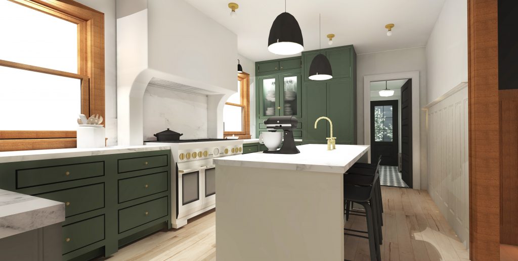
 People of the internet, greetings and salutations from my little neck of cyberspace. I wanted to write a post and share some exciting news, after 12 years of wanting to renovate our dysfunctional kitchen we are finally able to make it happen and we are going big! We have decided to extend the back end of our house and add on a mudroom, closet and half bath. This will allow us to make our kitchen READ MORE
![]()
People of the internet, greetings and salutations from my little neck of cyberspace. I wanted to write a post and share some exciting news, after 12 years of wanting to renovate our dysfunctional kitchen we are finally able to make it happen and we are going big! We have decided to extend the back end of our house and add on a mudroom, closet and half bath. This will allow us to make our kitchen READ MORE
Let’s Get Organized! Planning our Cabin Pantry
Being that it's the last day in January, I wanted to squeeze in a post about my plans for an upcoming organizational project. I know you have all heard of "spring cleaning" but honestly, what gets me through the middle and end of winter are indoor organizational projects. For me ...
The Frame TV is My New Best Friend
Hey Team! I wanted to dedicate an entire blog post to just how much I love the innovation that brought me/you/us the Samsung Frame TV. If you’re not familiar with the Frame TV, it’s a TV that moonlights as framed art! Samsung designed a TV that displays digital art (when ...
Good Looking Humidifiers & Space Heaters (cuz winter)
Hey Team! It's that time of year, you know what I mean - you're always feeling chilled and your lips are always dry. It's all the best parts of winter (a major N-O-T on that one). I've recently been on the hunt for both a not-ugly heater for my office ...
Make a USB Charging Hub
Hey budz! I’ve been busy reorganizing the DCHH headquarters (aka as my sunroom office). I’m obsessed with cord coralling and maintenance because it can have such a big impact on a space. Cords just look bad, there’s no two ways about it. To combat ugly cord scenes that we all ...
Decorating in Stages While Still Achieving the Look Your After
Having the cabin has taught me a few things about design. It can be done in stages and having a plan is a really good thing. When we took ownership of the cabin we knew that we needed to make it our own, and fast. Jeff especially has a hard ...
Starting the New Year with an Office Makeover
I wasn’t kidding around about the goals I set for myself for 2020 – I really want to give it my all and push myself to post twice a week. I figure if I don’t really try, I won’t know if it’s possible. Worst case scenario, I figure out what ...
A look back on 2019 & Goals for 2020
Friends, budz, guys, dudes, dudettes! I'm sharing a post today about the new year, my plans for it, and how I'm going to crush my 2020 goals. I'm also re-capping on all the cool stuff that got done in 2019. I'm so excited for the new year, I feel like ...
Polaroid Memories & Guest Book
Today I wanted to share how we share and save memories at the cabin. In addition to a guest book we have also started filling a bowl full of polaroid photos. Remember polaroids? They went extinct in the early oughts but have been recently brought back to life by The ...