


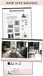
You may or may not have noticed a few cosmetic changes to the blog that I’ve been slowly making over the last three or four weeks. I’ve been planning on updating fonts and adding submenus to the navigation for some time, but my hand was forced a bit when I accidentally broke my blog a few weeks back. I was totally freaking, as I do anytime my blog disappears from the face of the internet, but slowly I was able to get it back.
The brunt of the damage was to my side bar. I had to rebuild it from scratch, and had to build it fast. I’m sure it’s not assembled “properly,” but you probably don’t notice anything. I know that technically it is not perfect, and that drives me crazy. Anyway, it was my blog-and-photo-buddy Amanda from willful/joyful who promised me that it would be even better when I was done with it as I was losing my mind on Twitter. At the time I didn’t believe her, but she was right. It’s better now than it was before.
 A lot of the blogs I follow I do so for both content and design. I am kind of superficial about it, but I love a well designed blog like nobody’s business. I have blogs I follow just so I can go and see what new cool functions and tricks they’re adding. I don’t wanna sound like a jerk, but I sometimes could care less about the actual content. I throw it all out the window for a nice photo and a pretty face. Of course there are other blogs where I only care about content… Anyways, I hope you get the picture. If you’re like me in that way you might be into some of things I’m gonna share with you. If you’re not, this post will probably be kind of boring, sorrizzle in advance :)
I finally took the plunge and got a subscription to typekit.com. That’s where all the cool new fonts are coming from these days. I have been rocking the Futura pretty hard and the body is now all in Adobe Garamond Pro. I wanted the body of the blog to feel more like a magazine or old book. Futura on the cover, a nice serif font on the inside. I also went nuts on some custom style sheets and started to style all of my old blog posts. By “style” I mean that I added custom captions for numbered so-and-so’s and whatnots and special attributes for headings I wanted to highlight. I don’t blame you if you haven’t noticed any of this. It’s all very small, but I love doing it.
I made my comments look pretty! Well at least I think I did. Prior to my blog breaking I used a lot of the standard out-of-the-box ‘thesis theme’ styles for my comment section. Since I was re-doing everything I now had a reason to restyle my comments. They’re so many different variables when it comes to styling comments. For example; I reply to you, you reply to me, you reply to that other commenter, you decide you don’t want to comment and hit cancel, etc etc. It’s hard to test out all the different scenarios to make sure the they always look perfect. If you notice anything funny about the comments please let me know, and I’ll try my best to fix it ASAP (screenshots of the problem and browser info help a lot).
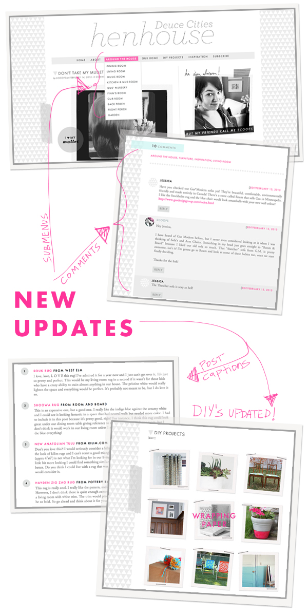
I also changed up the navigation menu a bit. There are now drop down (aka sub menus) for the “Around the House” section. You can now search by room via the drop down, and then see a chronological history of the room. Detailed I know, but I always enjoy picking through “house tours” on other homie blogs that inspire me.
The DIY section got a face lift too, before it was really static and rigid and hard for me to update. Now it’s much easier to navigate as well as for me to update so there’s no reason why it shouldn’t always be current with the latest DIY’s and tutorials. I know I was getting behind on it before, I’m a bad blogger.
I also added a new section called “Inspiration” there you will find all of my style boards plus any products or cool things I have featured on the blog throughout the ages.
Please let me know if you’re having any trouble with the new look. I’m not a web developer; I just do as much as I know how to do. Roonz brought it to my attention last week that my blog was looking like a total crap fest on Internet Explorer 8. I had no idea that was even an issue, and I’m glad she told me about it. I spent the whole weekend coming up with a solution and ended up making it look nice on IE8 in the end. The point is, if it looks weird for you, I will do my best to fix it cause I don’t want this blog that I have poured endless hours into looking untyte.
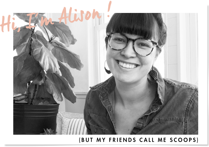
Mucho Love,
Scoops


Loverly! Your font selection is spot on. And following a blog for it’s design more than for it’s content? I’m so guilty. Not with you though — you’re great all around. I’m glad my peptalk helped. And getting to say I told you so? Tyte :)
Lol’d.
i know this is soooo late to comment on this post, but i just found your blog and instantly fell in love with your design! do you offer any design services by chance? or are you using a theme?
Hi Alycia, Thank you so much! I work really hard on the site design and function, so it’s always the best to hear when people notice. I don’t offer any design services yet, but it’s something that I was thinking of pursuing in the coming months – would it be okay if I looked you up when I decided to start designing and coding blogs for other people?
Yes absolutely! that would be amazing :) thanks for the response :)