


Yeah, Buddies! Oh what a stressful week it has been. I’ve mentioned that I love coding css, but I absolutely dread dealing with all the technical wordpress-y stuff. I think that awful website experiences just think I am so cool, that they just love hanging out with me.
Sunday was supposed to be the big day that I installed my new site on a new wordpress theme, but the internet had a different plan for me. There are so many gut wrenching bad details that I don’t want to relive, so I will just spare you the bad stuff and share with you my new site instead!
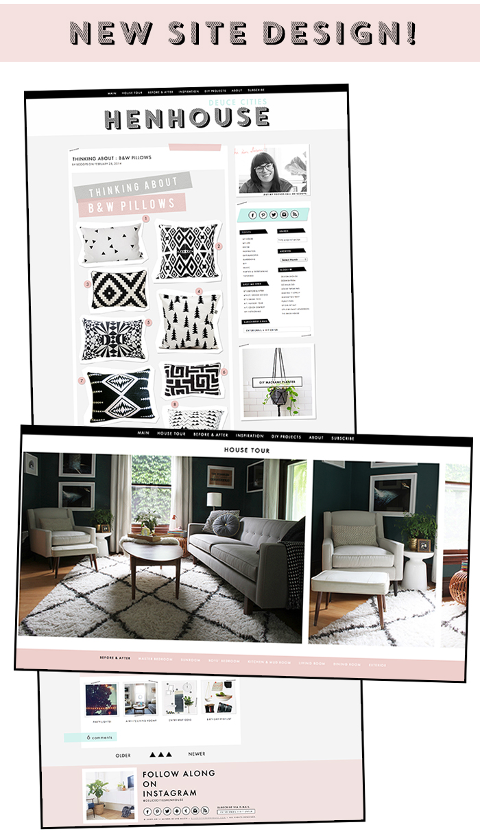
I am so happy with the new look, it’s like a more grown up version of the old site, don’t ya think? I wanted to go clean and minimal – but still have a site infused with my own style and aesthetic. I love the contrast of flat 2D internet surfaces (like the post boxes in the content column) juxtaposed with a bit of 3D illusions (like the drop shadows) seen in the sidebar. You know I still love my tape strips, I had to keep them, but I just updated them a bit. It’s like flat digital washi tape, you guys. The triangles had to go, I do adore them, but it was time. You’ll notice that I decided to use them as a break in between my posts instead of as an entire background.
I updated the logo – I’m really into the Core Circus font found over at myfonts.com. Now it emphasizes “Henhouse” instead of “Deuce Cities” (I totally regret my blog name choice sometimes). I fixed the position of the Navigation bar so if you are on a desktop browser you will be able to access from anywhere on the site – even if you scroll to the bottom of the page. I muted the colors and went heavy on the black and white, if you notice, these same color patterns have been happening in my home a lot lately too.
I think the comment section turned out really well, and I hope you agree. I wanted it to be clean and simple, but still pretty – comments are hard to style because there are so many ways you, and your readers can respond to something, but I think for the most part it is all working well and looking tyte.
I tidied up the sidebar and minimized the proportions just a bit, now it takes up less visual space. Since the sidebar is smaller, I have more room to feature even larger images in the content. In my experience with the internetz, I prefer seeing pics in sizes between 600 and 700 pixels. Mine are sized to 670!
The ‘DIY Projects‘ section got a face lift – it’s something I have to update manually, but as a group I really like the look of all the images and the rollovers add a nice effect.
I added some social share icons to the bottom of my posts so you, the reader can easily share if you so desire.
The ‘Related posts’ (seen at the bottom of each post) got updated. For all you css nerds out there, you may notice that I styled each related post background differently using pseudo classes, excellent (Wayne’s World shout out).
The footer has all sorts of ways to follow along via social media, plus an e-mail sign up if you’d like to get posts sent directly to your inbox.
The big thing that I have been working on is the ‘House Tour‘ section of the site. Instead of your typical vertical scroll it’s all horizontal, and I included a ‘Before & After’ section to the menu where you can see the progress of our home over time. We’ve been living in our house for four years now, and a lot has happened, just very slowly. The ‘Before & After’ speeds up that experience for you.
There are still a lot of kinks to be worked out, especially on the mobile side as well as a few relic browsers, but I am confident with in a few weeks everything will be working super smoothly. I would invite you to let me know about any weirdnesses you are experiencing, but do me a major favor and wait a few days – I don’t think my mind could handle the stress, I’d just rather not know about it for now ;)
I’m just so happy to finally be able to share this with you guys. I hope you enjoy all the new changes!


I love the new look! It does have a more “grown up” look, yet is still fun. : ) and I like the add on to the name.
~Sarah : D
Thanks Sarah!
Love the new look! Cannot wait to explore!
Yeah, get to it! And Thank You!
Love the new site! It looks amazing! I just found your blog recently and love to check on it once a week to see your updates. Congrats on the new look =)
Thanks for stopping by Katy! Glad you found me :)
It looks great, Alison! You fancy thing, you. Having a new site design to post onto is so fun!
I totally hear you on the blog name regret, haha. I’m pretty sure at least 95% of bloggers rue the day they thought of their blog’s name! What I wouldn’t give to go back in time…I like Deuce Cities Henhouse, though!
Yes, I am so excited to post in this new site! I feel like everything looks better :)
Well, I like Manhattan Nest, so there – but yes – I think we probably all feel blog-name-regret. Cue the sad trombone.
LOVE the new look!! SO PRETTY!!
Thanks, Jacquelyn!
1.) I really like your blog name! It’s refreshing and fun.
2.) The design is so great. Still deucecities but so clean and even more classy!
3.) The scrolling widget (?) thing on the right side bar is fantastic. It’s so smooth!
Congrats! I know it’s been a labor of love. Now go relax your brain!!
Thanks, Emily. I have a close friend, who shall not be named, who thought the blog was called due-set-ees (with an Italian accent) – ever since then I have not felt so good about it.
The scrolling widget is so easy. The plugin is called Easy Slider – you can even buy a fancier version if you want to put sliders all over your site, we will have to get one for you ;)
You’ve got skills girl! I absolutely love it. I know you’re wordpress so maybe it doesnt apply to me, but how did you create the popular post widget /rollover thing on your sidebar? I love that it doesn’t take up a lot of space!
Thanks, Caroline! It’s called Easy Slider – you should look into it and see if they have something available for your platform. It’s so easy to use.
It all looks fantastic! I especially love the home tour and before & afters pages — the horizontal scroll in a nice touch, it looks great and it sets you apart design-wise from everyone else. Plus, the pages and the house in them look really, really great. ^_^
Awh, Thanks AnnMarie! I’m glad you are like the house tour – it took me hours and hours to build, so I’m glad you like it. There still needs to be a lot of work done to the mobile version of the house tour, but I’ll get it there. Just not this week ;)
the new site looks amazing! I love it. man I need a blog page redesign so bad but theres no way in hades I could ever even think about pulling something like this off. youre so darned good girl. off the explore even more:)
ok so your home tour page is AMAZING. I love it!
Thanks Shavonda! I’m so glad you like the house tour page!
Wow girl you got skills! Love the new design…Especially the post roll in the sidebar!
Keep popping in here to keep up with your fab blog, and it really looks so fresh now!
Congrats! (PS! Fancy doing mine…lol!)
Hey June, Thanks so much! The scrolling sidebar is called Easy Slider – not sure if it’s available for blogger, but you should look into it. As of right now I am just venturing out into the big world of coding for others – I am going to attempt to do a friends site this spring. If all goes well I may put myself out there to do others, but honestly after all the chaos I just faced with my own blog, I’m not sure if I could handle all that pressure!
LOVE the new look. Only comment would be that the font size on the posts is a little small. I found myself really having to concentrate. However, I like that the column is a little slimmer than the old style, which makes it easier to read.